Pinkston
BRAND REFRESH
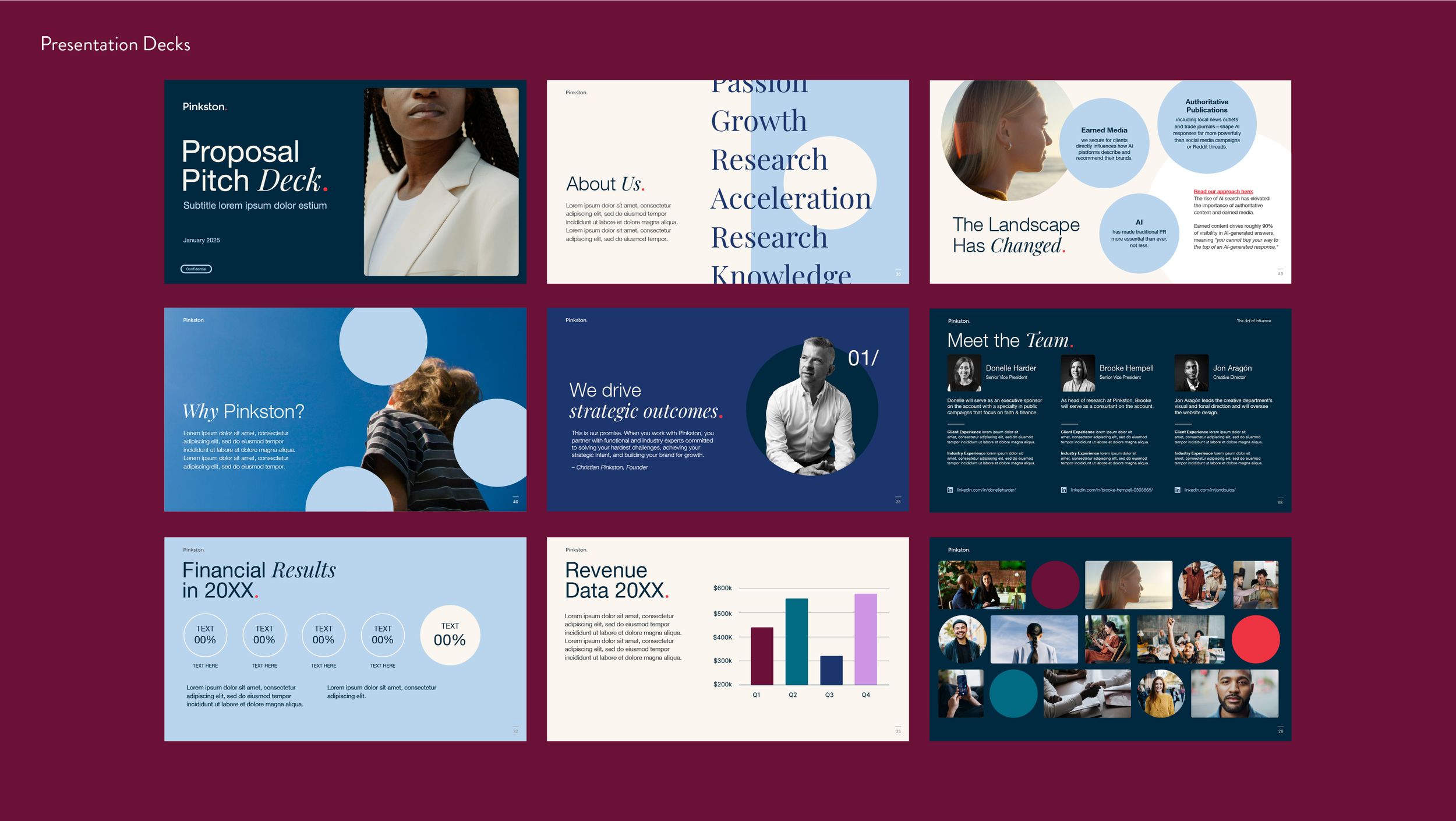
Pinkston is a branding, marketing, and communications agency that works with a select group of clients to shape strategy, build awareness, and drive influence. When the firm began a visual refresh, I was asked to lead the brand design.
The only requirements were to retain the existing logo and signature red, while elevating the red dot as a defining brand motif. The result is a system where the dot serves as both a wayfinding element—signaling clarity and direction—and a spotlight that draws focus to key messages and visuals.
The expanded color palette was designed to feel intelligent and understated, reinforcing Pinkston’s identity as a covert sherpa: quietly pioneering strategic solutions while guiding clients with confidence and care.